Works
Home
Works
Grads
#isolatingtogether
Nathaniel Rojas
Motion Design/Time-Based Communication
- - Magazine
Lily Do
Book/Editorial
2001: A Rundown
Henry Wilkinson
Information Design
2020: A Pandemic in Review
Paniz Adiban
Book/Editorial
2face
Jan Ly
Motion Design/Time-Based Communication
A Flight Through History
Danny Lum
Print/Brand Communications
A Guide to SPS
Elise ZiYuan Wang
Information Design
A Life on Our Planet
Leah Fellows
Motion Design/Time-Based Communication
ADHD Handbook
Alex Blechta
Book/Editorial
Advantage
Rafael Flora
Interaction Design/Product Design
Aidey Bandages
Paco Lui
Packaging Design
All is Fair in Love & Online Dating
Julia Greco
Book/Editorial
Am I/I Am
Lily Do
Installation
Amiy
Sophie Zhao
Interaction Design/Product Design
BPAC Brand Identity Redesign
Fatima Raid
Print/Brand Communications
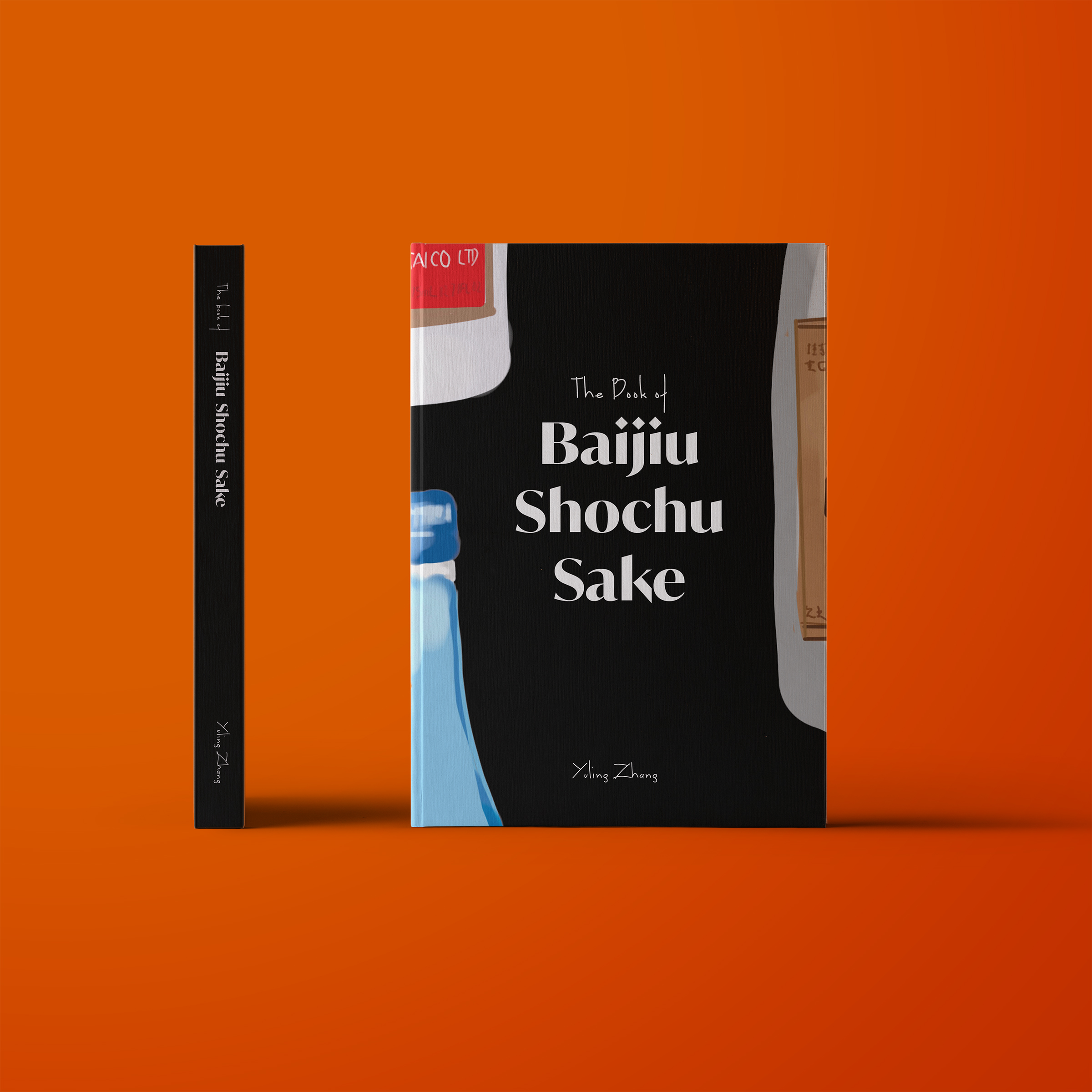
Baijiu, Shochu, Sake
Yuling Zhang
Book/Editorial
Bala Cranberry Festival
Lindsey Jones
Print/Brand Communications
Bata!
Natalie Almosa
Packaging Design
Baybayin Archives
Angelene Sagun
Web Design
Beaver
Valery Marier
Packaging Design
Befriend
Tiffany Chau, Selina Chung, Sharyl Man
Interaction Design/Product Design
Blossoming Toronto
Julia Paliy
Information Design
Bracket
Nathan Chandler
Book/Editorial
Branch
Dainia Townsend
Print/Brand Communications
Bread Magazine
Emmanuel Ashun
Book/Editorial
Broadway Play
Elyssa Biringer
Interaction Design/Product Design
Brush Buds
Samantha Crawford
Packaging Design
Buddibots
Natalie Almosa
Game Design
Béo
Grace Lim
Interaction Design/Product Design
CRESS Brand + Website
Josh Gaspar
Print/Brand Communications
Candid Magazine
Racheal Cowley
Book/Editorial
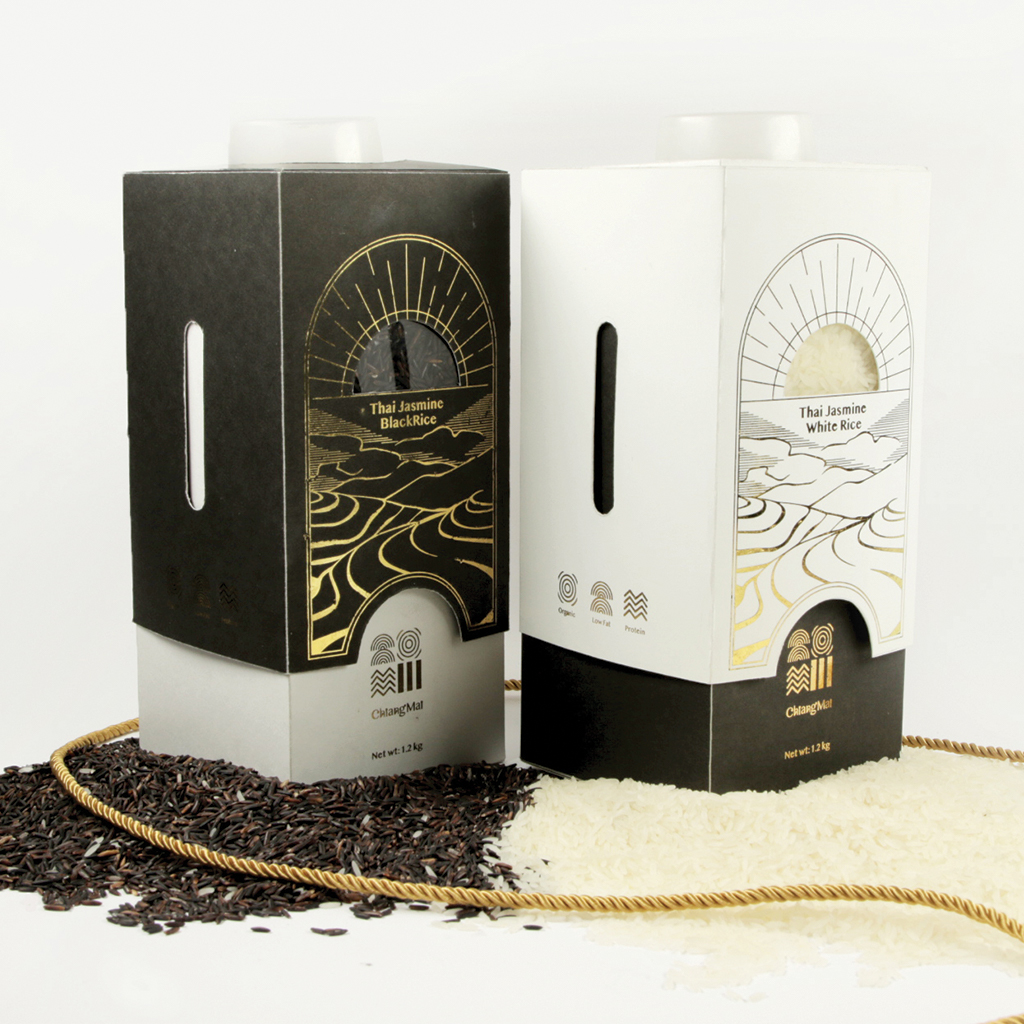
Chiang Mai
Selina Chung
Packaging Design
Choose Your Pokémon
Casey Wang
Motion Design/Time-Based Communication
Cinderella
Emily Wentland
Book/Editorial
Cleo
Brittany Tena
Packaging Design
Cleo
Felicite Keng
Interaction Design/Product Design
Clutterbug Magazine
Samantha Crawford
Book/Editorial
Co-Space
Vanessa Cassar
Print/Brand Communications
Contact
Emily Ong
Book/Editorial
Convergence Journal
Helena Kim
Book/Editorial
Cool It
Andrew Del Rizzo
Interaction Design/Product Design
Country Life
Elyssa Biringer
Typography
Cover Yourself, Spa Kit
Cavina Nguyen
Packaging Design
Covid Cases in Ontario
Emily Malcolm
Information Design
Cyber Space Adventure
Sion Kim
Interaction Design/Product Design
DECO SWEET
Victoria Yong
Packaging Design
Deskollab
Emily Malcolm
Interaction Design/Product Design
Details and Design
Fatima Raid
Print/Brand Communications
Diablos Chocolate
Luisa Jahn
Packaging Design
Digital Opportunity Trust
Sion Kim
Print/Brand Communications
Directory Typeface
Victor Wong
Typography
Dog Leash Packaging
Antoni Dalewski
Packaging Design
Don't Forget...
Samantha Crawford
Book/Editorial
Dreamscape
Mena Rimac
Experimental/set Design
Ears Wide Open
Nicole Lee
Book/Editorial
Embers S'mores Kit
Erika Kawaguchi
Packaging Design
Expanse
Andrew Del Rizzo
Interaction Design/Product Design
Experience Exposure
Colin Coulson
Interaction Design/Product Design
Experimenting with Materials
Antoni Dalewski
Book/Editorial
EyeAssist
Joel Desjardins
Interaction Design/Product Design
Facing Self
Hyunan Ryu
Book/Editorial
Fatherless
Kristina Campeau
Book/Editorial
FilminColour
Tatiana Terenzio
Web Design
Fine Lines
Emily Ong
Book/Editorial
Flaneuse - Editorial Design
Celena Liu
Book/Editorial
Fortune Noodles
Nicole Chan
Packaging Design
FreshCity
Bernarda Avila
Print/Brand Communications
Friends of Ruby Rebrand
Emily Zathey
Print/Brand Communications
GEM
Cavina Nguyen, Amy Davidson
Interaction Design/Product Design
Getaway Candles
Georgia Bellingham
Packaging Design
Ginkgo
Kira Hassard
Interaction Design/Product Design
Gladiolous
Cindy Lieu
Interaction Design/Product Design
Globowl
Amanda Tsiang
Interaction Design/Product Design
Go Bananas!
Erika Kawaguchi
Print/Brand Communications
Go Seeds
Holden Kao
Packaging Design
Going Braless Zine
Beth Snyder
Book/Editorial
Good On Ya
Vanessa Cassar
Packaging Design
Guided
Rangavi Logaratnam, Alex Bletcha, Colin Coulson
Interaction Design/Product Design
Hachette Book Group Re-Brand
Sabrina Fortin
Print/Brand Communications
Haenyeo Museum Rebrand
Janet Sohn
Print/Brand Communications
Harshlands
Jan Ly
Book/Editorial
Hassle Free Clinic
Colin Coulson
Print/Brand Communications
Hello Friend
Paniz Adiban
Interaction Design/Product Design
Historia
Kiran Patel, Paco Lui, Andrew Del Rizzo
Interaction Design/Product Design
Hot 100 Genres
Kiran Patel
Information Design
Hotline Bling
Gaganjeet Saggu
Information Design
How to (not) write a song
Ivy Sun
Web Design
How to Win
Nathaniel Rojas
Motion Design/Time-Based Communication
Human
Janet Sohn
Book/Editorial
I Remember you,
John Yeon
Web Design
Idea Lab
Sarah Carriere, Amy Davidson
Print/Brand Communications
Ilya: A Cyrillic Variable Font
Makeba Gaskin
Typography
Interface Redesign of SOBS
Jessica Dou
Interaction Design/Product Design
Ixcocoa
Bernarda Avila
Packaging Design
Joslyn Castle Identity Design
Ferzeen Ansari
Print/Brand Communications
Just a Bunch of Books
Rachelle Willemsma
Motion Design/Time-Based Communication
KEYLIME
Kelsey Ketcheson
Typography
Kata Hand Wraps
Colin Coulson
Packaging Design
Kawa 川
Rachel Wong
Packaging Design
Kindred
Jessica Dou
Interaction Design/Product Design
Komunidad
Meagan Malixi
3D Design
Kong Identity
Janet Sohn
Apparel Design
LUIA TYPEFACE
Yuling Zhang
Typography
Laundro
Ferzeen Ansari, Elyssa Biringer, Nathan Chandler
Interaction Design/Product Design
Laurel
Danny Lum
Interaction Design/Product Design
Learning Hangeul
Nicole Lee
Motion Design/Time-Based Communication
Link
Sarah Carriere
Book/Editorial
Listening
Riley Urquhart
Book/Editorial
Local
Joel Desjardins
Interaction Design/Product Design
Long Story Short
Christine Chow
Motion Design/Time-Based Communication
Lumi
Emily Wentland
Packaging Design
MOCA Rebrand
Angelica Li
Print/Brand Communications
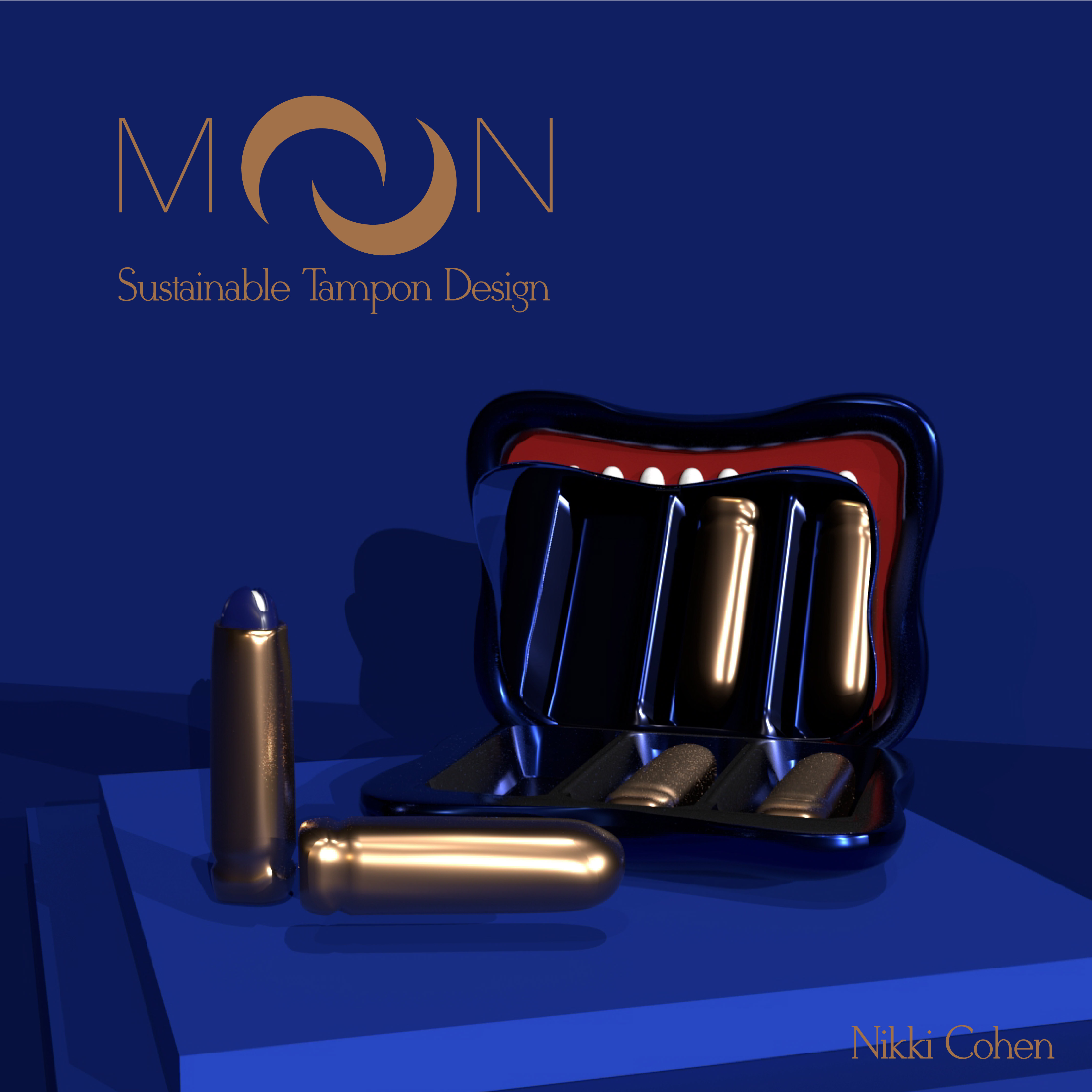
MOON
Nikki Cohen
Package Design, Product Design and 3D Modeling
Madcaps
Nathan Chandler
Print/Brand Communications
Madeline Kinney Photo Book
Rae Kearney
Book/Editorial
Maganda
Alexa Salagubang
Book/Editorial
Mangia Pasta Company
Julia Greco
Packaging Design
Mellow
Natalie Almosa
Packaging Design
Metamorphosis
John Yeon
Installation
Mic Mac Moe
Victor Wong
Packaging Design
Miimi
Kiran Patel, Paco Lui
Interaction Design/Product Design
Momentum
Sophia Kim
Interaction Design/Product Design
MoneyTree App
Celena Liu
Interaction Design/Product Design
Morning Affirmations
Elyssa Biringer
Motion Design/Time-Based Communication
Morning Paper
Gaganjeet Saggu
Interaction Design/Product Design
Mr. Robot Title Sequence
Henry Wilkinson
Motion Design/Time-Based Communication
Museum Brand Concept
Isabella Chan
Print/Brand Communications
My Discovery
Rangavi Logaratnam
Print/Brand Communications
My Life in 2020, Visualized
Rachelle Willemsma
Information Design
Nai Cha
Victor Wong
Packaging Design
Nani
Ashna Ray
Print/Brand Communications
Nation of Two Book Collection
Leah Fellows
Book/Editorial
Neum
Sophia Kim
Packaging Design
Neutral Avenue
Sarah Carriere
Book/Editorial
New Closet
Casey Wang
Book/Editorial
Night Fever
Julia Greco
Book/Editorial
Nikkei Matsuri
Ivy Sun
Print/Brand Communications
Nix
Thano Sipsis, Henry Wilkinson, Amanda Tsiang, John Yeon
Interaction Design/Product Design
Objects With Feelings
Holden Kao
Experimental
Oneiric Oblivion
John Yeon
Book/Editorial
Ontario Parks Rebrand
Karilyn Xu
Print/Brand Communications
Orido
Rachel Wong
Packaging Design
Otherworldly' Font
Robyn Chmelyk
Typography
Ottawa Public Library
Lindsey Jones
Print/Brand Communications
Out of Sight Campaign
Emily Zathey
Motion Design/Time-Based Communication
PANLE TEA
Yuling Zhang
Packaging Design
Paanch Phoron
Ashna Ray
Packaging Design
Pegia
Paco Lui
Interaction Design/Product Design
Petal Pop
Erika Kawaguchi
Packaging Design
Plantopia
Kira Hassard
Book/Editorial
PlayAR
Helena Kim
Interaction Design/Product Design
Please Let Cool and Enjoy
Nicole Chan
Book/Editorial
Preserving Real Connections
Felicite Keng
Book/Editorial
Progress March On
Rachel Wong
Print/Brand Communications
Ren's Pets Re-brand
Brittany Tena
Print/Brand Communications
Reptilia Rebrand
Alexa Salagubang
Print/Brand Communications
Resisting Erasure
Makeba Gaskin
Book/Editorial
Ring Ring
Jenny Tiêu
Information Design
Ritua App
Racheal Cowley
Interaction Design/Product Design
Roots & Ray
Nikki Cohen
Print/Brand Communications
RoundTable
Celena Liu
Interaction Design/Product Design
Searching for the Spark
Thano Sipsis
Print/Brand Communications
Shambhala Music Festival
Mena Rimac
Print/Brand Communications
Shared Dishes
Jenny Tiêu
Interaction Design/Product Design
Shomigo; Your shopping amigo!
Arsheen Virani
Web Design
Simple Future
Alan Frenkel-Andrade
Book/Editorial
Sleep Paralysis
Helena Kim
Motion Design/Time-Based Communication
Smartsole
Mena Rimac
Interaction Design/Product Design
So, you want a dog?
Heather Chang
Information Design
Sohwakhaeng (shh)
Lily Do
Packaging Design
Sondering
Georgia Bellingham
Interaction Design/Product Design
SpaceScape
Sabrina Fortin
Print/Brand Communications
Sponge World
Dawson Wilson
Environmental Design
Spot App
Leah Fellows
Interaction Design/Product Design
Stages of Stress
Gaganjeet Saggu
Motion Design/Time-Based Communication
Starlight Rebrand
Emily Malcolm
Print/Brand Communications
Stone To The Bone
Samm Campbell
Book/Editorial
Stringing Cultures Together
Julia Paliy
Information Design
Sunberry
Heather Chang
Packaging Design
Sunday: Chủ Nhật Collection
Jenny Tiêu
Packaging Design
Sweet
Katie Bensley-Marshall
Book/Editorial
Swift Redesign
Angelica Li
Print/Brand Communications
Switch Magazine
Josh Gaspar
Book/Editorial
TCAF Rebrand
Amanda Tsiang
Print/Brand Communications
TO2019 Chinatown Festival
Sharyl Man
Print/Brand Communications
TTC Rebrand Project
Cavina Nguyen
Print/Brand Communications
Tabraille - Design Thesis
Riley Cousineau
Interaction Design/Product Design
Tandem. Go Global.
Katherine Ng
Interaction Design/Product Design
The ARI Exhibition
Nikki Cohen
Print/Brand Communications
The Bloody Truth
Racheal Cowley
Information Design
The Canadian City Guide Series
Brittney LeBlanc
Book/Editorial
The Drake Hotel Rebrand
Amy Davidson
Print/Brand Communications
The Glass Castle
Brittney LeBlanc
Information Design
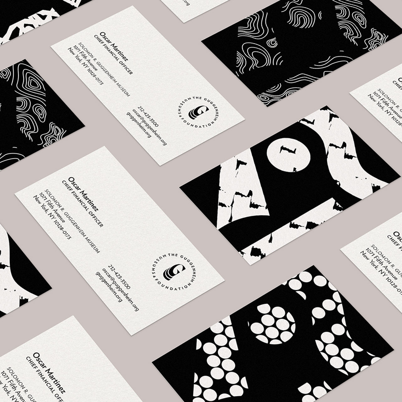
The Guggenheim Rebrand
Meagan Malixi
Print/Brand Communications
The Little Things
Emily Zathey
Book/Editorial
The New Palette
Francesco Roda
Interaction Design/Product Design
The Pessimist Magazine
Julia Paliy
Book/Editorial
The Process
Riley Urquhart
Book/Editorial
The Salvation Army Rebrand
Nathaniel Rojas
Print/Brand Communications
The Shape of Nature
Emily Wentland
Information Design
The Tale of Two Paths
Georgia Bellingham
Packaging Design
Things I Never Said
Tatiana Terenzio
Book/Editorial
Tiger Beer Package Refresh
Riley Cousineau
Packaging Design
Toronto Mesh
Henry Wilkinson
Print/Brand Communications
Toronto Oktoberfest
Riley Urquhart
Print/Brand Communications
Touch
Meagan Malixi
Book/Editorial
Touraround
Emily Ong
Interaction Design/Product Design
Trauma Theory
Christine Chow
Motion Design/Time-Based Communication
Unnie
Jamie Kim
Motion Design/Time-Based Communication
Unravel
Tiffany Chau
Interaction Design/Product Design
Unrequited Love
Alex Blechta
Book/Editorial
Untouched Natural Deodorant
Tatiana Terenzio
Packaging Design
VICE Rebrand
Sarah Carriere
Print/Brand Communications
VIIU: A Card Game
Elise ZiYuan Wang
Game Design
Vaulti
Sophie Zhao
Interaction Design/Product Design
Vermicomposting
Karilyn Xu
Information Design
Very Bad, Feels Sad
Samm Campbell
Environmental Design
Video Accessibility
Heidi Trautmann
Interaction Design/Product Design
WWF Identity Redesign
Danny Lum
Print/Brand Communications
Wander
Ivy Sun
Interaction Design/Product Design
Wavelength
Amanda Tsiang
Interaction Design/Product Design
Weft
Jamie Kim
Book/Editorial
Women & Co.
Bernarda Avila
Book/Editorial
Woodstock
Heidi Trautmann
Motion Design/Time-Based Communication
Xihei: A Variable Blackletter
Rachelle Willemsma
Typography
Y'Know
Jackson Adley
Interaction Design/Product Design
YMCA Canada Rebrand
Nicole Lee
Print/Brand Communications
all the little things.
Elise ZiYuan Wang
Packaging Design
archives.design
Valery Marier
Web Design
create clarity
Isabella Chan
Print/Brand Communications
gentle encounters
Sandy Liang
Installation
j.doe Magazine
Sandy Liang
Book/Editorial
kem
Cindy Lieu
Typography
magoo
Kira Hassard
Packaging Design
passively, possibly
Jan Ly
Web Design
period.
Kristina Campeau
Packaging Design
pithy
Johanna Lim
Packaging Design
tracks
Josh Gaspar
Interaction Design/Product Design
Ánima
Luisa Jahn
Book/Editorial
‘Autumn Peltier’ Campaign
Robyn Chmelyk
Print/Brand Communications
‘Béo’ Tablet App
Robyn Chmelyk, Luisa Jahn, Bernarda Avila
Interaction Design/Product Design
게임 엠가 game emga
Hyunan Ryu
Packaging Design